
KPop Demon Hunters isn’t just visually striking, it’s deliberately coded.
Behind the neon performances and supernatural battles lies a carefully constructed color language that guides viewers through the film’s emotional stakes, character arcs, and moral boundaries. Every major shift in tone, loyalty, or danger is reinforced through color choices that work quietly but powerfully in the background.
Here’s how KPop Demon Hunters uses color as a storytelling tool, and why it’s essential to understanding the film’s deeper narrative.
The Core Color Palette: Identity, Unity, and Balance
The film’s visual foundation is built around pinks, purples, and blues, a palette that defines both the tone of the movie and the identity of the central girl group, HUNTR/X.
These colors dominate:
- Performance sequences
- Group interactions
- Safe or emotionally aligned moments
Together, they create a sense of harmony and cohesion, reinforcing the idea that HUNTR/X functions best as a unified force. The palette mirrors the polished world of K-pop while also softening the supernatural elements, making the demon-hunting aspect feel integrated rather than intrusive.
Purple, in particular, acts as a bridge color, blending emotion and power. It visually links the group’s public image with their hidden responsibilities, suggesting that their strength comes from balance, not perfection.
Yellow as Life, Energy, and Emotional Safety
Yellow appears sparingly, and that’s what makes it effective.
In KPop Demon Hunters, yellow signals joy, vitality, and emotional connection. It often appears during:
- Successful performances
- Lighthearted interactions
- Moments where the characters feel truly alive
Symbolically tied to the sun, yellow enhances audience warmth and optimism. When it shows up, viewers are subconsciously reassured that things are aligned, even if danger looms nearby.
By limiting yellow to specific emotional beats, the film ensures those moments feel earned rather than constant, strengthening the emotional payoff.
Green and Dark Teal: Danger Beneath the Surface
When the film wants you to feel uneasy, it shifts sharply away from its core palette.
Green and dark teal are used to signal:
- Demonic presence
- Corruption
- Moral imbalance
These colors dominate fight scenes and eerie locations, including claustrophobic interiors like saunas and underground spaces. Because green directly contrasts with the pink-purple-blue harmony of HUNTR/X, its appearance immediately disrupts visual comfort.
This contrast creates tension without relying on dialogue. Even before a demon is fully revealed, the color alone prepares the audience for danger.
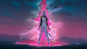
Red and Magenta: Power Turned Malevolent
Red is the film’s most aggressive color, reserved almost exclusively for villains and demonic forces.
It represents:
- Blood
- Obsession
- Passion twisted into corruption
Magenta-heavy lighting and costuming amplify emotional volatility, especially during confrontations. These colors feel intense and invasive, visually overpowering the protagonists’ softer tones.
This symbolism becomes especially important in Rumi’s character arc. Her purple hair is not just a design choice; it’s a visual metaphor. Purple blends:
- Red (her demon lineage and suppressed power)
- Blue (her humanity, empathy, and restraint)
As Rumi struggles internally, lighting and saturation subtly shift to emphasize one side over the other, allowing viewers to track her conflict visually.
The Honmoon Barrier: Color as Moral Evolution
The Honmoon shield is one of the film’s most important visual symbols, and its color progression reflects the story’s philosophical core.
- Blue represents protection, souls, and emotional sincerity
- As the shield strengthens, blue intensifies, signaling growing unity
- The theoretical goal is gold, symbolizing perfection
But the film ultimately rejects gold as the endpoint.
Instead, the Honmoon culminates in rainbow hues, representing diversity, individuality, and emotional honesty. This moment reframes the narrative’s values: strength comes not from flawlessness, but from embracing differences and imperfections.
It’s a quiet but powerful rejection of idealized purity in favor of collective authenticity.
Lighting and Saturation: Emotion Without Words
Beyond color selection, KPop Demon Hunters uses lighting direction and saturation to guide emotional interpretation.
Key techniques include:
- Desaturation during isolation or internal conflict
- Heavy shadows to convey fear or secrecy
- Upward lighting on red-toned figures to emphasize menace
In Rumi’s arc especially, scenes of self-doubt are marked by muted tones and reduced contrast, visually distancing her from the vibrant world of HUNTR/X until she reconnects with her purpose.
These techniques allow the film to communicate complex emotions without explicit exposition.
Why This Visual Language Works
KPop Demon Hunters succeeds because its color storytelling is consistent and intentional. The film trusts its audience to feel the story rather than be told it outright.
By using color to reinforce:
- Character identity
- Moral alignment
- Emotional transformation
the movie creates depth that rewards repeat viewing and fuels fan analysis.
This visual sophistication is a major reason the film resonated globally and continues to inspire discussion well beyond its release.
Check out It’s Netflix Nerd for our latest reviews, updates, release news, and information about Netflix movies and series.