
KPop Demon Hunters doesn’t just tell a story with music and demons — it tells it with color. Every frame of the animated film is built around a deliberate palette that reflects character, emotion, Korean culture, and the movie’s central themes of identity, unity, and destiny.
A World Painted in “Magical Girl” Energy
Instead of relying on simple, rigid color-coding for each heroine, the film leans into layered, nuanced shades that mirror the complexity of its leads. The trio of demon-hunting idols — Rumi, Mira, and Zoey — aren’t boxed into one personality or one hue. Their outfits, hair, and surroundings constantly shift across scenes, more like a living mood board than a standard animation model sheet.
This choice gives the movie an elevated “magical girl meets K-drama” aesthetic. Reds lean slightly pink, greens carry hints of blue, and most tones feel tertiary rather than primary. The result is a world that looks soft yet powerful, delicate yet undeniably bold — a visual language that instantly sets KPop Demon Hunters apart from more conventional animated fantasies.
Iridescence: The True Color of the Story
Gold might seem like the obvious “hero” color at first glance. The narrative revolves around the dream of creating a Golden Honmoon — a protective barrier powered by music and fan love that can seal the demon world away. But as the story unfolds, it becomes clear that the film’s real visual heart lies in iridescence: shimmering blends of pinks, blues, and soft greens that refuse to stay in a single category.
This iridescent spectrum quietly threads through the film long before the climax. It appears in the girls’ clothing, in Rumi’s markings, and in the glow of their attacks and shields. By the time the Golden Honmoon is surpassed by a Rainbow Honmoon, the payoff feels earned — the colors have been whispering that transformation into the story from the very beginning.
Weapons as Visual Music
Even the weapons in KPop Demon Hunters are designed less like traditional blades and more like extensions of sound and spirit. Rumi’s Four Tiger Sword, Mira’s curved blade, and Zoey’s spirit weapons look fluid and luminous, as if made from liquid light rather than steel.
The design approach treats these weapons as visualized music — trails of color, energy, and rhythm that echo the idea that performance and spiritual strength are deeply intertwined. The inspiration from cymatics, where sound frequencies form visible patterns, reinforces that the world’s magic system is built as much on vibration and harmony as on combat.
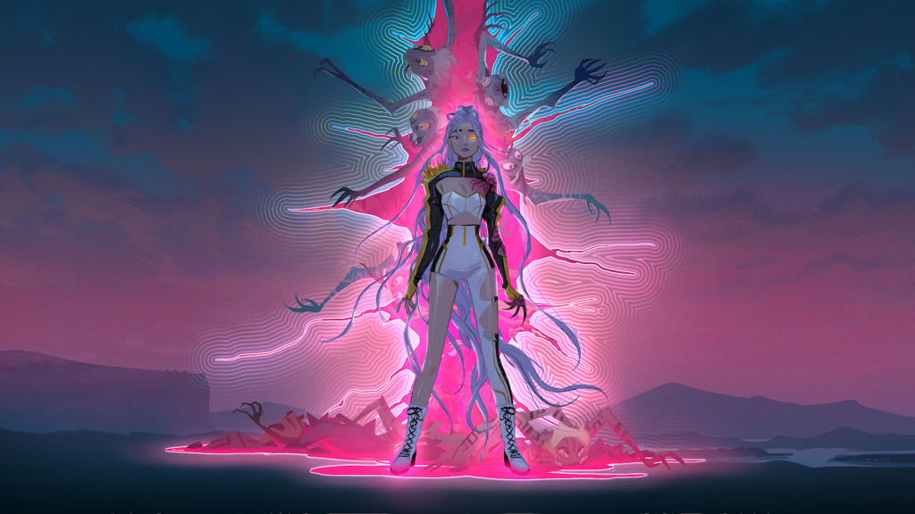
When Magenta Means Danger
If iridescence represents hope, unity, and musical power, magenta is the color of dread. The demon realm and its influence seep into the story through electric, almost unnervingly bright magenta tones. Rather than defaulting to stereotypical “hell red,” the film uses hot pink-magenta to signal the presence and power of the demon lord and his forces.
Whenever magenta flames or atmospheric tints dominate the screen, it’s a clear sign that the demon world is asserting itself. In one standout motif, a normally bright and colorful Seoul slips under a magenta haze when the demon boy band exerts control, hinting that even the most candy-coated performances can hide sinister intent.
Idols Who Refuse to Be Color-Coded
Most animated heroes live in a single outfit. HUNTR/X lives in an entire wardrobe. The girls cycle through dozens of looks — stagewear, street fashion, pajamas, and more — all of them trend-conscious and character-specific. Yellow, for example, doesn’t belong to one girl; it appears across the trio in different cuts, fabrics, and accents, reinforcing that they’re individuals who still feel like a unit.
This fashion-forward approach supports a key idea: they “belong together” without ever looking like a forced team uniform. They aren’t classic color-coded squads, nor are they boxed into the reductive visual shorthand often used for girl groups. Their style choices communicate confidence, evolution, and personal taste, not just branding.
The Hair Color Obsession
Hair becomes its own storytelling battlefield. Rumi’s purple hair might seem straightforward, but the team agonized over its exact shade — how light, how cool, how layered. Animators treated hair not as a flat fill but as something with depth, translucency, and texture.
Mira’s hair color is an even more deliberate puzzle. It lives somewhere between coral, pink, and soft red — so unique that even the creators struggled to name it. The internal nickname “Mi-red” says everything: it’s less a known swatch and more a signature shade that exists because Mira exists. That specificity underlines the film’s larger thesis: these girls can’t be reduced to simple labels, visually or emotionally.
From Bubblegum Idols to Gothic Demons
The Saja Boys’ palette runs on contrast. They debut as ultra-bubblegum idols, wrapped in soft pastels — baby blues, teals, pinks — that feel almost too sweet to be real. This intentional cuteness primes viewers for maximum shock when their true demon forms are revealed.
When they transform, their magenta skin and bold markings feel like a visual slap, snapping the audience out of the fantasy and exposing the darkness beneath the polished pop package. The shift proves that in this world, style is never superficial; it’s a narrative device that tracks power, corruption, and truth.
Soft Lighting, Strong Emotions
The film borrows heavily from K-drama visual language, especially in how scenes are lit. Instead of harsh contrast and graphic shadows, the lighting is soft, layered, and almost dreamy. That gentleness puts enormous pressure on the animation, because flaws can’t be hidden in heavy stylization; everything is exposed.
Crucially, “soft” doesn’t mean “weak.” High-stakes battles — like the showdown on a speeding train — play out in palettes of pinks and purples rather than standard high-contrast action tones. That decision reframes femininity, showing that vulnerability, tenderness, and pastel hues can coexist with intensity and strength.
In the end, KPop Demon Hunters builds an entire visual theology around color: iridescence for collective destiny, magenta for threat, pastels for deceptive charm, layered hues for complex heroines. The film doesn’t just ask who its characters are — it asks what they look like when they’re fully themselves, and then lets the color answer.
Check out It’s Netflix Nerd for our latest reviews, updates, release news, and information about Netflix movies and series.